Retail Experience Design · Physical Installation
Trailmark Outdoors
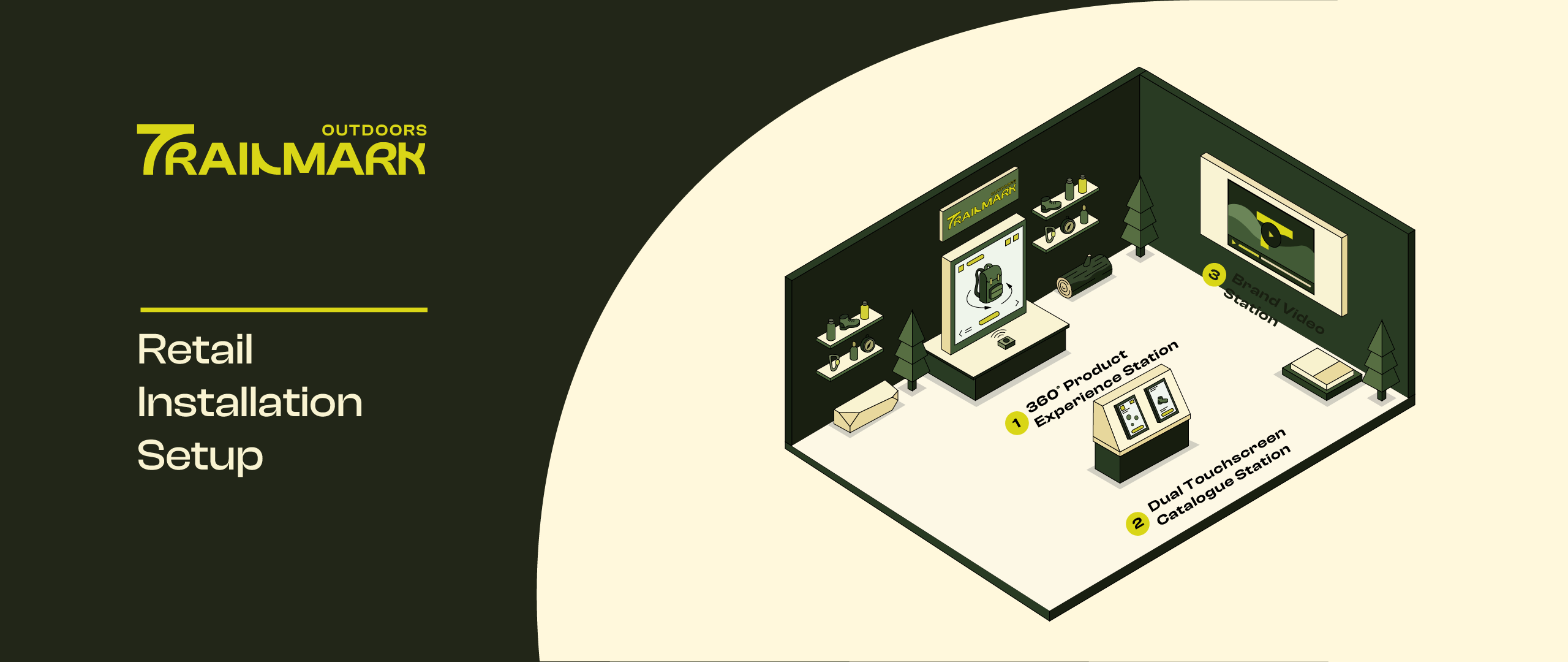
In-Store Interactive Retail Installation
00 — Overview
Bringing the outdoors
inside the store.
Trailmark Outdoors needed a retail presence that matched the ambition of its gear. The brief was clear: transform a static showroom into a living brand experience — one that lets customers engage with product details, discover the full catalogue, and feel the brand's identity before they make a purchase decision.
We designed three interconnected interactive stations that together create a cohesive, immersive journey through the Trailmark universe — from product close-up to brand story.
"The physical store shouldn't just stock product — it should make you feel like you already belong on the trail."
The Challenge
Outdoor retail customers need to trust their gear before they buy. Static displays and price tags don't build that trust. We needed to create moments of genuine product discovery.
Our Approach
Three distinct stations, each serving a different stage of the customer journey: explore the product in depth, browse the full range, and connect with the brand's story.
Client / Brand
Trailmark Outdoors
Outdoor gear & apparel
Project Type
Retail Installation
Interactive Experience Design
Tools Used
Figma · Miro · Protopie
Physical prototyping
360° Product
Experience Station
The centrepiece of the installation. Customers interact with a physical product hero display paired with a large interactive screen that lets them rotate, zoom, and explore every detail of Trailmark's flagship gear — seams, materials, attachment points, weatherproofing — in a way the product on a shelf never could.
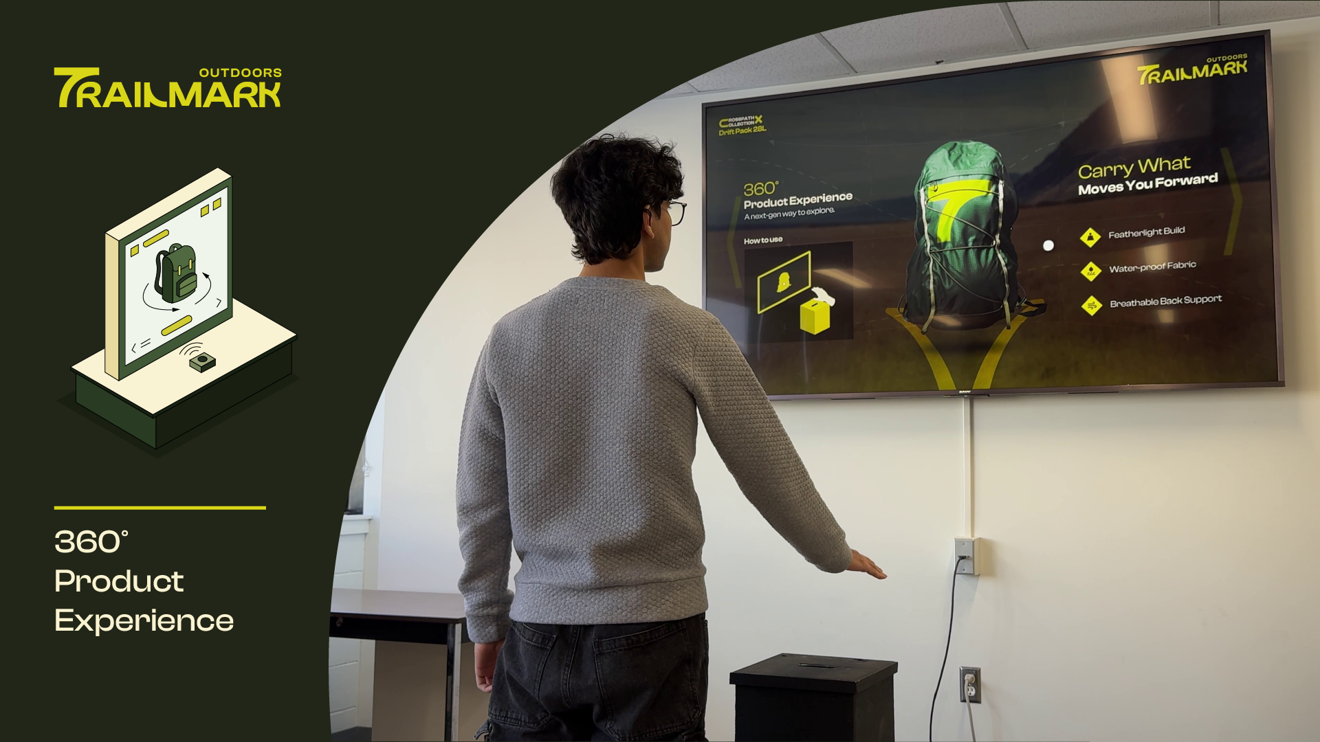
The Experience
A customer approaches the station and is immediately drawn by the product hero display at eye level. The accompanying touchscreen invites them to grab and rotate a 3D model — same proportions as the physical piece beside it. Hotspots reveal material callouts, care instructions, and trail-specific use cases.
- 3D rotation — full 360° horizontal and 180° vertical pan
- Material hotspots — tap any zone for specs and story
- Scale reference — toggle human silhouette for size context
- Companion display — physical product mounted alongside screen
Design Decisions
We kept the UI invisible until needed — no persistent nav chrome, just the product. The 3D model occupies 80% of the screen at rest. All interactions are single-touch gestures to accommodate gloved hands and customers carrying items.
Typography is set large (minimum 24px body) for readability at arm's length in a bright retail environment. Contrast ratios tested against store lighting conditions.
Dual Touchscreen
Catalogue Station
A side-by-side dual-screen browsing station that lets customers explore the full Trailmark catalogue simultaneously — one screen for browsing categories, one for deep-diving a selected product. Designed for couples shopping together, or a single user comparing two products head-to-head.
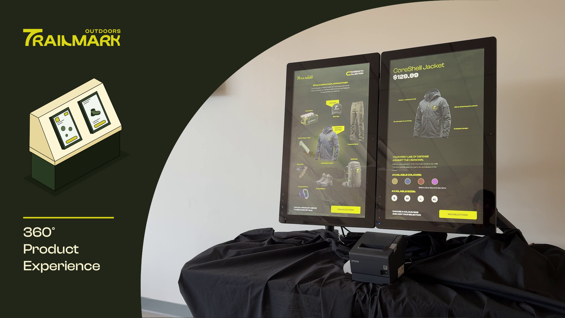
The Experience
The left screen acts as the catalogue browser — organised by category (Hiking, Trail Running, Camping, Climbing), season, and activity level. Selecting any product on the left immediately populates the right screen with detailed specs, imagery, colour variants, and stock availability.
- Split-screen sync — left browse feeds right detail panel instantly
- Compare mode — pin two products side-by-side on right screen
- Filter system — filter by activity, weight, season, price tier
- Staff QR — generate a QR code to save selection to phone
Design Decisions
The dual-screen setup required a consistent visual language that still allowed each screen to feel independent. We used a shared colour system but different layout densities — the browser screen is tight and scrollable, the detail screen is spacious and image-led.
A key challenge was deciding what happened when both screens were touched simultaneously. We implemented a simple ownership model: the most recent touch event takes priority per screen, with a subtle visual lock indicator.
Brand
Video Station
The emotional anchor of the installation. A large-format ambient video display that plays Trailmark's brand films on a loop — trail footage, athlete stories, origin narratives. Not a product pitch; a feeling. Positioned at the entrance to set the tone before customers interact with anything else.
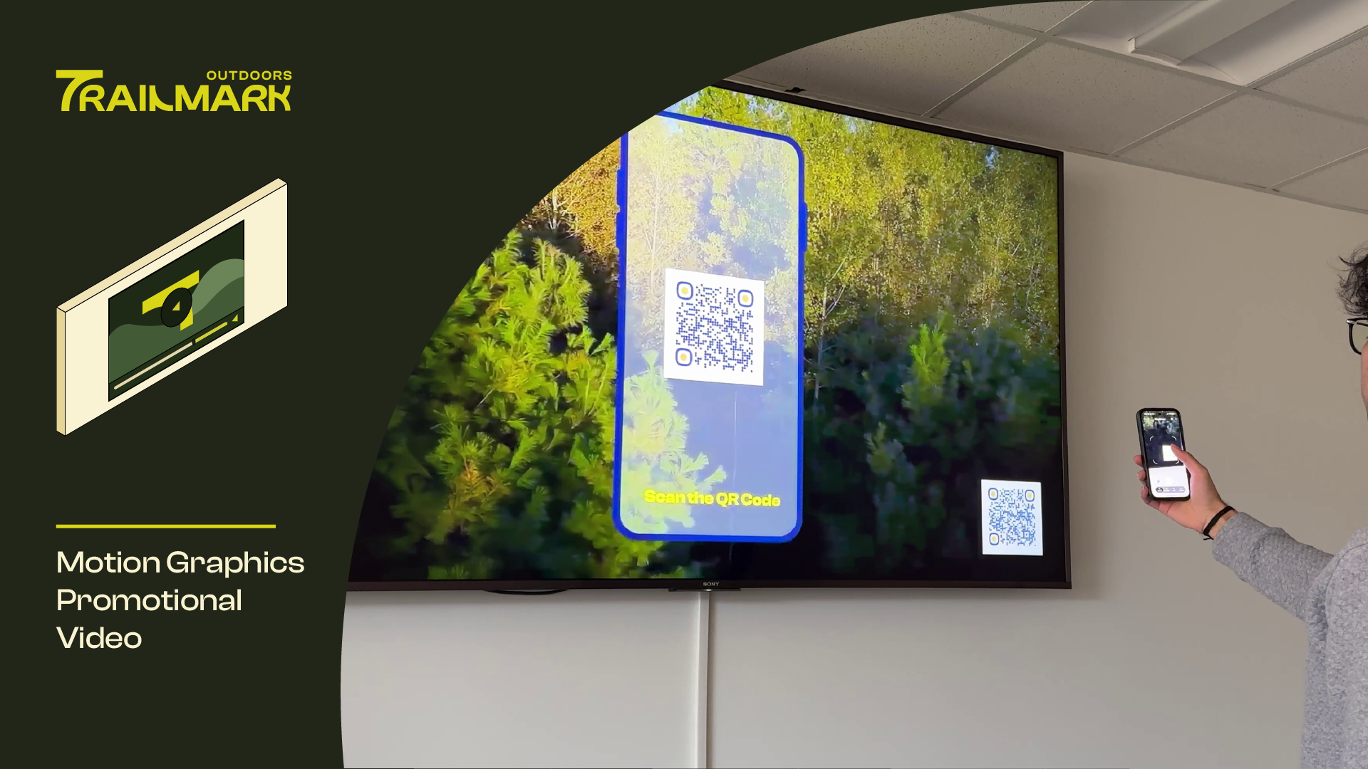
The Experience
A wide-format screen plays Trailmark's film content at ambient volume — enough to draw attention, quiet enough not to intrude. Customers who pause in front of it for three seconds trigger a subtle interactive overlay inviting them to explore that story further on a companion tablet mounted below.
- Ambient loop — brand films play at reduced volume continuously
- Proximity trigger — dwell detection activates overlay after 3s
- Chapter navigation — companion tablet lets viewers jump to stories
- Athlete profiles — tap any featured athlete for their full story
Design Decisions
The hardest design problem at this station was the overlay timing. Too fast and it interrupts the film; too slow and customers move on before it appears. We tested intervals from 1.5s to 6s before settling on 3s as the sweet spot that felt like invitation rather than interruption.
The companion tablet interface was deliberately stripped of Trailmark branding — it felt more premium when it became purely about the content rather than the brand promoting itself.